
Long Time Horizons and the Investment Edge They Provide - Explained in a Dozen Charts
Executive Summary: Short-term equity market returns are volatile and unpredictable. Long-term returns are much less volatile and fairly predictable with the use of sound valuation analysis. Disciplined investors with long time horizons have a distinct investment edge over other equity market participants, particularly those with short time horizons.
“Investors should remember that excitement and expenses are their enemies. And if they insist on trying to time their participation in equities, they should try to be fearful when others are greedy and greedy only when others are fearful.”
We talk a lot about AlphaGlider having a long time horizon when it comes to our investments. We think it gives us a distinct investment edge. Let me explain what I mean with the help of a dozen charts.
Consistently beating the market over the short-term is extremely difficult. AlphaGlider cannot do it, and I am skeptical of anyone who says they can. Relative to long-term investors, short-term investors are penalized with higher transaction costs, such as trading fees and bid-ask spreads. Short-term investors pay higher capital gains tax rates and pay those capital gains taxes earlier than later, thereby losing precious capital with which to compound. But I think the biggest headwind for short-term investors is their own emotions - greed and overconfidence when markets are doing well, and fear and under-confidence when markets are doing poorly. Actually, emotions are probably the main impediment for all investors, but they are particularly challenging for investors with short-term investment horizons in which outcomes are highly volatile and unpredictable.
Emotions, when unrestrained, frequently result in poor investment decisions. This is borne out in study after study of investor behavior. The table below is from DALBAR’s most recent annual survey of retail investor performance:

The average retail investor’s equity investments returned only 5.26% annually over the last 10 years, well below the S&P 500’s^a 7.67% (see red boxes). Remember, these are 10-year, annualized returns, so the compounded return after 10 years is +67.0% for the average investor versus +109.4% for the S&P 500–a substantial difference. The average fixed income investor did even worse relative to his index, returning only 0.69% annually versus the Barclays Aggregate Bond Index’sb 4.71% (over 10 years that’s +7.0% for the average investor and +58.4% for the index; see green boxes). DALBAR attributes most retail investor underperformance to investment mistakes driven by emotion.
Just how volatile are equity returns and how does time horizon impact them? Below is a chart that shows the range of maximum and minimum annualized S&P 500 total real returns for various time periods since 1950. The ‘total’ refers to the inclusion of reinvested dividends from owning the S&P 500, and the ‘real’ refers to adjustments due to inflation (in contrast to DALBAR’s numbers which are nominal). The periods are monthly rolling periods, measured as of the first of each month. For example, the first 10-year period in the dataset extends from January 1, 1950 through December 31, 1959. The second extends from February 1, 1950 through January 31, 1960. And so on.
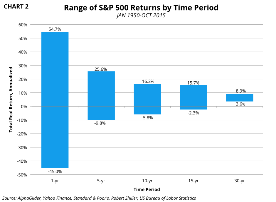
The volatility that a short-term investor has to endure is gut-wrenching. 1-year S&P 500 returns have ranged from +55% to -45% over the last 65 years. One only needs to look back to March 2008, a time when many investors had been confident after watching the S&P 500 generate a cumulative 150% total real return over the previous five years. Those unfortunate to buy into the market that month saw their investment fall over 40% in real terms over the coming 12 months. And then if they had capitulated at that point and remained in cash, they would have missed the subsequent near real tripling of the S&P 500. Mix short-term investment horizons and human emotions, and you get a recipe for buying high and selling low.
One of the best ways to restrain one’s emotions when investing is to extend one’s investment time horizon. As the chart above demonstrates, the volatility of outcomes collapses dramatically with longer time horizons. S&P 500 returns ranged from +16.3% to -5.8% annualized over 10-year periods. The absolute worst 30-year period for the S&P 500 was still +3.6% annually.
The above chart only displays the extreme returns by time period. To give a more complete picture of the impact of time horizon on the volatility of returns, I present the following two histograms. The first shows the distribution of S&P 500 total real returns with 1-year investment periods, while the second shows the returns distribution with 10-year investment periods.


Moving from a 1-year investment time horizon to a 10-year horizon massively lops off extreme outcomes and reduces the frequency of negative returns from 29% of the time to 19%. Investors who are able to extend their investment time horizons are less likely to be emotionally affected by the greed and overconfidence triggered by up markets, and the fear and under-confidence caused by down markets. The likelihood of better investment decisions is increased.
The elimination of emotions by adapting a long investment horizon is the cornerstone of a passive, ‘buy and hold’ investment strategy. As per the previously presented DALBAR data, the average equity investor would have been able to increase his annual return from 5.26% per year over the last 10 years through 2014 to something just less than the S&P 500’s 7.67% by buying a low cost S&P 500 fund. Vanguard’s S&P 500 ETF (VOO)c charges only 0.05% annually and can be bought without transactions fees in a Vanguard or TD Ameritrade account. On a $100,000 tax-deferred account, like a Roth IRA, the average equity investor with have earned an additional $41,447 by going the buy and hold route ($208,415 vs $166,968). The difference would have been even more in a taxable account where frequent trading by the short-term investor would have triggered more capital gains taxes during the 10-year period.
Passive investors aren’t the only ones to benefit from long investment time horizons. Active investors can also benefit greatly from expanded time horizons. It’s my experience that most fundamental analysis metrics and techniques are better at identifying valuation upside potential over longer time periods than shorter ones.
Let’s look at how well the most popular valuation metric, the price to earnings (PE) multiple, works in predicting future returns. Below is a scatter plot of 1-year total returns versus trailing PE (price divided by last 12 months of earnings) taken at the beginning of each month since 1950.

The chart shows that using a trailing PE to predict subsequent 1-year returns is absolutely useless for the S&P 500. The scatter plot resembles an oval, as demonstrated by the nearly flat linear regression line that has a near zero coefficient of determination (R2) value – see the line’s equation and R2 in red. The slope of the regression line gives the relationship between returns and trailing PE, in this case a nearly zero relationship (the slope here is -0.0004, the coefficient in front of the x in the line’s equation). R2 measures how far the data points deviate from the regression line. An R2 of 1.0 indicates all data points exist on the regression line. Our R2 here is effectively zero, indicating absolutely no relationship between future 1-year returns and trailing PE.
However, the trailing PE has been relatively effective at predicting longer-term returns. Below is a scatter plot of 10-year total returns versus trailing PE.

There is an obvious slope in the regression line, indicating that returns declined on average with higher PEs, as would seem logical. It shows that historically an investor has experienced better 10-year returns when the market was cheap, say 10-15x, than when it was expensive, say 25-30x.
The regression line’s R2 is 0.31, which indicates the data is far from a tight fit and thus the relationship between 10-year returns and trailing PE is somewhat weak. This can be seen when looking at the wide range of 10-year returns at 15-20x trailing earnings – many instances of negative returns, but also many between 5-10% annually.
The PE valuation metric can be a quite volatile over short periods of time, thus the weak R2 figure is not a surprise. The ratio’s denominator, earnings, is a significant source of this volatility. PE ratios are frequently at their highest when the market is at its cheapest and most attractive, such as in the trough of the recent recession. In March 2009, when the S&P 500 troughed, its trailing PE was 110x! One way to look through the noise caused by volatile earnings is to use the cyclically adjusted PE (CAPE) ratio. The CAPE is also known as the Shiller PE, named after Robert Shiller, the Yale professor and 2013 Noble Laureate who help popularize it. The Shiller PE uses the same price in its numerator as does the trailing PE, but instead of using the last year of earnings in the denominator, the Shiller PE uses average annual earnings over the last 10 years, adjusted for inflation. There is nothing particularly magical about 10 years, other than it being sufficiently long to capture most economic cycles. Below is a scatter plot of 10-year total returns versus Shiller PE.

The Shiller PE regression line here has the same slope and a similar y-intercept as the trailing PE regression line, but the R2 has improved to 0.40. For investors with a 10-year investment horizon, the Shiller PE valuation metric appears to be a better tool with which to make investment decisions than the more popular trailing PE.
Another way to visualize how well a valuation metric is at predicting future returns is to look at it over time against the subsequent return outcome. The following chart shows how poorly the Shiller PE was at predicting future 1-year total real returns of the S&P 500. The chart also does a good job of demonstrating how random returns are in the short term. Note that the Shiller PE axis is inverted, with Shiller PE values increasing (getting more expensive) as you go down the right y-axis.
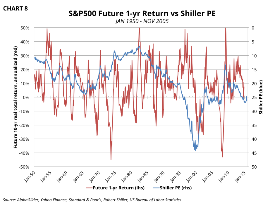
But extend out the investment time horizon, and the Shiller PE does a much better job. See the same chart below, but with future 10-year total real returns. These returns generally increased with lower (cheaper) Shiller PE levels, and vise versa. The Shiller PE did especially well at predicting future returns at its extremities. The Shiller PE correctly predicted that it was a great time to have bought the S&P 500 in the late 1970s and early 1980s, when the Shiller PE was hitting its lows of around 10x. It was a great time to have exited the S&P 500 in the late 1990s, when the Shiller PE was hitting its high of 44x. And it was smart to have bought the S&P 500 in March of 2009, when the Shiller PE touched 13x (recall that the trailing PE was an incredibly expensive 110x that month because of the short-term collapse in earnings). See the green circles on the chart for each of these points.

The previous chart shows that the Shiller PE was strongly correlated with future 10-year total real returns since the early 1980s, but much less so between the mid 1960s and the late 1970s when future returns were much worse than the Shiller PE predicted. I think this may have been the result of the interest rate environment at the time. Below is the same chart as above, but overlaid with the 10-year Treasury yield. The 1960s and 1970s were decades with rapidly rising interest rates, in stark contrast to the last two and a half decades which saw rapidly declining interest rates. It makes sense that one would pay less in PE terms for equities in a high and or rising interest rate environment as higher rates make Treasuries more attractive relative to other assets, including equities. And vise versa, one should pay more for equities in a low or declining interest rate environment. Read this article for more on the relationship between PEs and inflation (inflation and interest rates are highly correlated).

I believe the concepts behind the Shiller PE are solid, but its inability to incorporate the interest rate environment is an obvious weakness, a source of inaccuracy in its predictive power. However, I think this weakness can be mitigated by keeping in mind what type of interest rate environment we are in, and then focusing on Shiller PE data from similar time periods.
If one believes our current low interest rate environment will continue into the foreseeable future, it seems reasonable to use data since September 1981, the point when the 10-year Treasury yield peaked at over 15%, in a Shiller PE analysis. I’ve done this in the scatter plot below. Note that the regression line of future returns against the Shiller PE becomes much more statistically significant than in our 1950 to present scatter plot – more than doubling the line’s R2 to 0.83.

If one thinks that our current lower interest rate environment is over and that we’re in for a multi-year trend of rising rates, it seems reasonable use data from 1950 through September 1981 in our Shiller PE analysis. The scatter plot for this time period is below.

The Shiller PE scatter plots from the two time periods show significant correlation between Shiller PEs and future 10-year total returns for the S&P 500. However, the data from the period of risings rates (1950 - SEP 1981) indicates lower returns and a bigger falloff in returns for higher Shiller PEs (steeper slope).
As I write, we are currently at a Shiller PE of 26.4x – a level never reached during this period of rising rates. But if we extract from the regression line, we should expect a range of 0% to -7.5% total real returns annually, on average, from the S&P 500 over the coming 10 years. However if rates remain relatively low, the 1981-present data may be more applicable, indicating annual total real returns of approximately 5%, +/- a few percentage points. But I’m getting ahead of myself here – I will write a future post about what the Shiller PE is telling us about the current markets and how it has impacted how we have positioned our AlphaGlider strategies for the long-term.
At this point I hope I’ve shown that the Shiller PE can be quite useful in framing the probabilities and range of return outcomes for an equity investment. The Shiller PE is far from being a perfect crystal ball, but it does skew the odds of outperforming for its practitioner. We believe that the Shiller PE can be used to deliver long-term returns better than that of the overall market - which is what a passive, buy and hold investor gets. The buy and hold investor, by definition, owns assets all the time, regardless of how overvalued they are. By underweighting assets that have poor expected long-term returns and overweighting assets that have higher expected long-term returns, we think we can outperform the overall market over the long term.
So getting back to Warren Buffett's words at the beginning of this post - that excitement and expenses are investors' enemies. Not only does Mr. Buffett slay these two enemies with his long investment horizon, but uses it to his advantage to beat the market over the long-term.